Elephant
by Liz Dawson
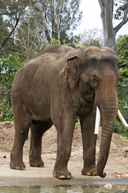
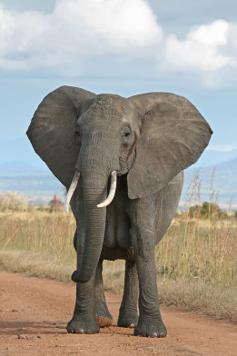
The elephant is often introduced with a picture. Nowadays usually a photograph similar to the ones below, showing its scale and particular attributes.


The drawing of an elephant I want to discuss does the same. However, there are some differences between the three elephants shown above.
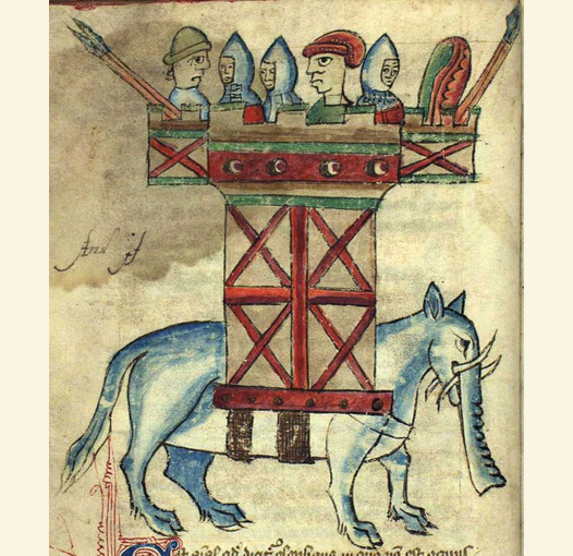
The drawing comes from the early 15th century ‘Bestiary of Ann Walshe’ now in the Royal Library in Copenhagen, which can be viewed online here.
The medieval bestiary was a book cataloguing animals (and often plants and rocks as well), many of which are now known to be fantastical. The standard format was an illustration of each creature followed by a short descriptive text, with the emphasis on showing how the animal’s behaviour demonstrated some aspect of Christian belief. Outside of academic discussions on the production and history of manuscripts, comment on their illustrations today tends to focus on the gulf between them and the anatomically accurate, often photographic images of animals we are now more used to seeing, and also on the fact that in the case of the non-European animals, the creator of the image would be unlikely to have seen the animal in question.
I would like to consider this image as it functions independently, and see how that relates to its original context of the medieval world and the pages of a bestiary. When it comes to images, we seem to expect a degree of autonomy from context not required from texts. This may be connected to the fallacy that there are absolutes in image making, generally aligned with photographic accuracy. The most interesting thing about this drawing today is how much like an elephant it still manages to be, and what kind of an elephant it has ended up being.
The internal logic of the drawing is deceptively simple, and holds together impressively when magnified. The original image comes from a page measuring 13.5 x 21cm, with the elephant illustration being approximately 12cm square. If you look at the image ‘full screen’ you’ll be seeing it much larger than the original. The lines of the drawing are in the same medium as the lines of the text in the bestiary, and in a sense in the same style. The mixture of curves and corners which make this image strangely jarring when seen out of context seems much less unusual in amongst pages of Gothic script.
 As a line drawing, with washes of local colour in some areas, this elephant is a long way from the gold leaf backgrounds and complex patterned borders found in more luxurious bestiaries. (A good example of a particularly high-end bestiary viewable online is the Aberdeen bestiary).
In terms of discussing how the reading of an image can change, this is an advantage. Illustrations where the depiction of the animal is subservient to decorative pattern carry their context with them, to a certain extent. The animals in the Ann Walshe bestiary were drawn before the text and text embellishments were put on the page.
Faint guidelines mapping out which areas would be text and which image were the only thing to be drawn beforehand[i]. This suggests the drawings were considered the most difficult part of the book to produce.
The elephant is blue-grey in colour, and carries a tower-like structure on its back. It looks angry in a comical way. An eyebrow and a point in the top edge of the eye concentrate its expression. This could be indicating mood, or simply following the same rhythm of line found in the creature’s hooves. The animal is recognisable as an elephant due to the tusks and trunk. Look at the picture without the lower half of the head and you’ll see some kind of sturdy ungulate – an overweight horse or a pointy-eared cow. The shape of the body seems to have been stretched to accommodate the tower it’s carrying, but the structure of the hooves and lower legs is clear. The ears, neck and head are equine; everything elephantine is squeezed into the bottom half of that head.
This elephant is constructed from familiar parts; a cow’s tail, a horse’s ears, possibly a wild boar’s tusks. The only way it would be dissectible would be back into these constituents, each containing its own set of references to the familiar. Standing on a bare paper background somewhere between a diagram and a drawing, or between text and drawing, it is a map of the gulf between the elephant and the creatures which would have been familiar to a 15th century reader.
[i] David Badke, The Bestiary of Ann Walshe, 2001, http://bestiary.ca/articles/anne_walshe/index.html
Each element which makes up the animal is observed to a ‘good enough’ standard. The eye is recognisable as an eye, the ear as an ear. In this time and this context, there is no motivation for the observational element to go any further; clearly fitting into the category ‘eye’ or ‘ear’ is enough. And, in a much less image-rich world, these categories were far more homogenous than they are now. In this drawing, and throughout the bestiary, larger than life eyes stare out at us. They follow the same pattern – the top edge is wider than the eye, with a semi-circle below forming the bottom edge. The iris is attached centrally to the top with plenty of space around it. These eyes are clearly eyes first, and parts of an animal second, having more in common with each other than with any of the bodies they inhabit. In this sense they are as much a symbol for the eye as a representation of it, playing the same role in the body of the animal as a letter does in the body of the text.
 Perhaps it is appropriate that this elephant is so clearly an approximation, using small pieces of the familiar to build up a picture of the unknown or unseeable. That sums up exactly the medieval philosophy of universal allegory; the idea that everything in the visible world is symbolic of something deeper and more important and was constructed to be so. At some point, ‘serious’ illustrations of animals stopped looking back at the viewer through enlarged, human-like eyes. They became divisible not into parts of other familiar creatures, but into the parts specific to themselves.
 This coincided with the shift from a medieval world view of classification based on similarities to an enlightenment one based on difference.
Medieval bestiaries are particularly interesting locations to find traces of people looking at and thinking about animals, because they were created at a time when the most interesting thing about an animal was considered to be the intention behind its behaviour (even though this was at the time thought to be located in the ‘mind of god’ rather than the mind of the animal). This was followed by a long period where the focus switched to understanding how the body of the animal physically works. Today focus has returned to the intelligence governing animal behaviour. However, in order for a 15th century audience to understand the body and behaviour of the elephant as representing an idea, they first needed to have some understanding of what an elephant physically is. To achieve this, each element of the animal has been
represented in an abbreviated way, sufficient to map out an impression of the unfamiliar creature. Like all drawings it is a collection of abbreviations, and as always, out of context the meaning of abbreviations can shift.
The sheer number of images, and the ways we categorise them, have multiplied exponentially since this drawing was made. This obscures, perhaps, the number of ways of image making which have disappeared. The logic of building an elephant out of pieces of cows and horses has vanished, and the outline of an elephant is now one of the most recognisable animal silhouettes there is. Simplified curves and unusual proportions have become deliberate choices with widely accepted readings. This drawing, and its ability to describe, has been hijacked by the subjectivity of its own methods of description. It has become a curiosity in itself, rather than a representation of one.
Monster
by Christian Bär
